
BY: DEWEY CROCS
We’ve seen teasers and leaks of these new NHL “Reverse Retro” jerseys for months now. Last Monday, the league rolled out the Adidas project, and there are some good ones and some not so good ones. It’s really an emotional roller coaster looking at all 31 jerseys.
If there’s anyone who can give you an honest report on all these new ReVeRsE ReTro jerseys, it’s me, Dewey. Let’s take a peek at all the new jerseys for all 31 teams and grade each one. (No, I’m not a teacher, so if you don’t like my grades, then take a lap and simmer down).
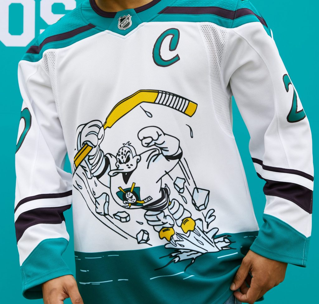
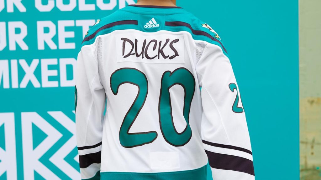
Anaheim Ducks
The Ducks have one of the best throwback logos in the league, so it’s a huge question mark why they didn’t go in that direction. Though the nostalgia is there from the Mighty Ducks TV Series, I think they could’ve been better.
Grade: B
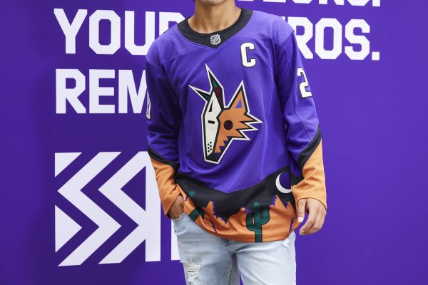
Arizona Coyotes
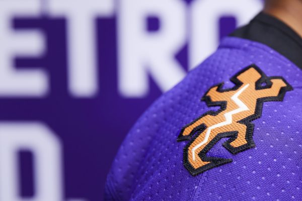
Another team with a very clean throwback with the Kachina look. Though these aren’t the full Kachina look, these are fun, and I can’t wait to see them on the ice. Auston Matthews will look great in this jersey in a few years too.
Grade: A+
Boston Bruins
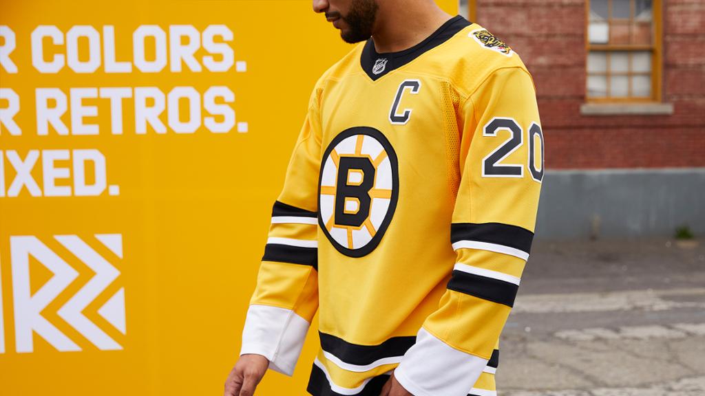
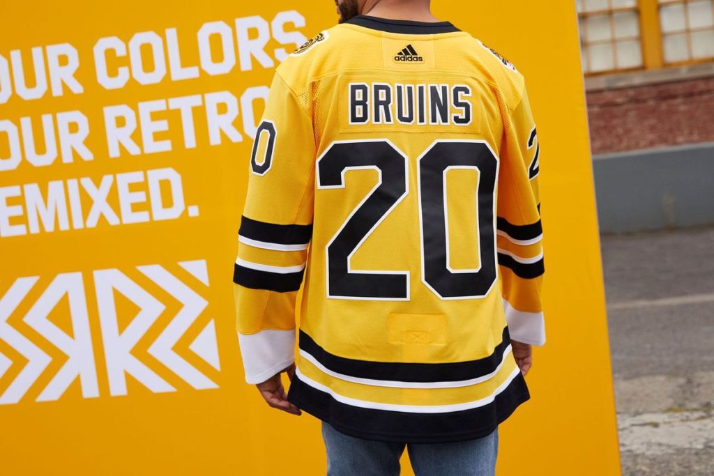
One of the leaks that came out about a week or so before the league’s reveal, the Bruins made a good decision here and going with the gold jersey. Ever hear of “less is more”? Because this is it. Jack Edwards is going banana-lands already.
Grade: A-
A good friend from Baaaahston, Melissa from Reile talk, has other thoughts, though: “Are they clean? Yes. But, Meth Bear on the shoulder was not the move, should have been on the chest instead.
Grade: C
Buffalo Sabres
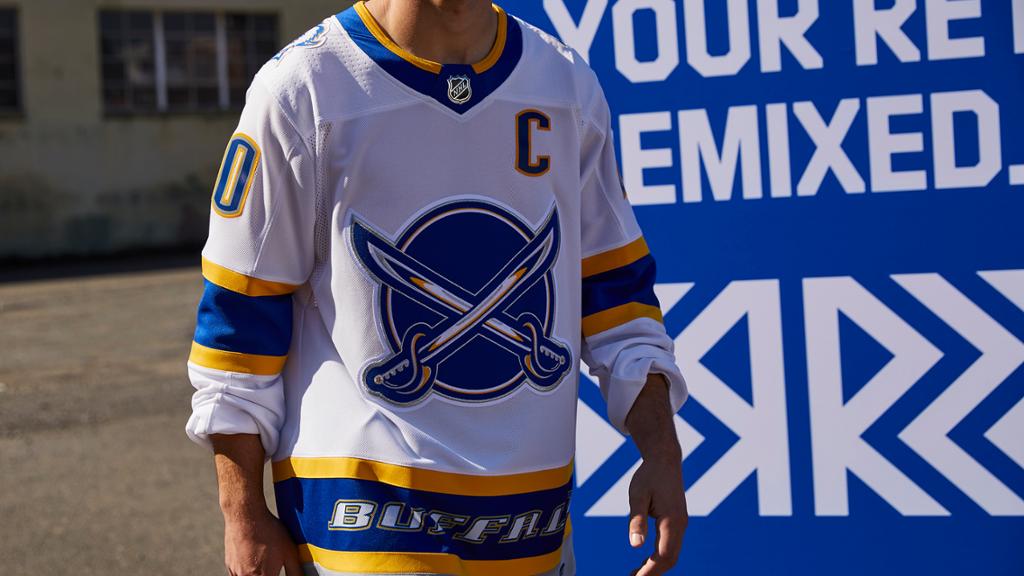
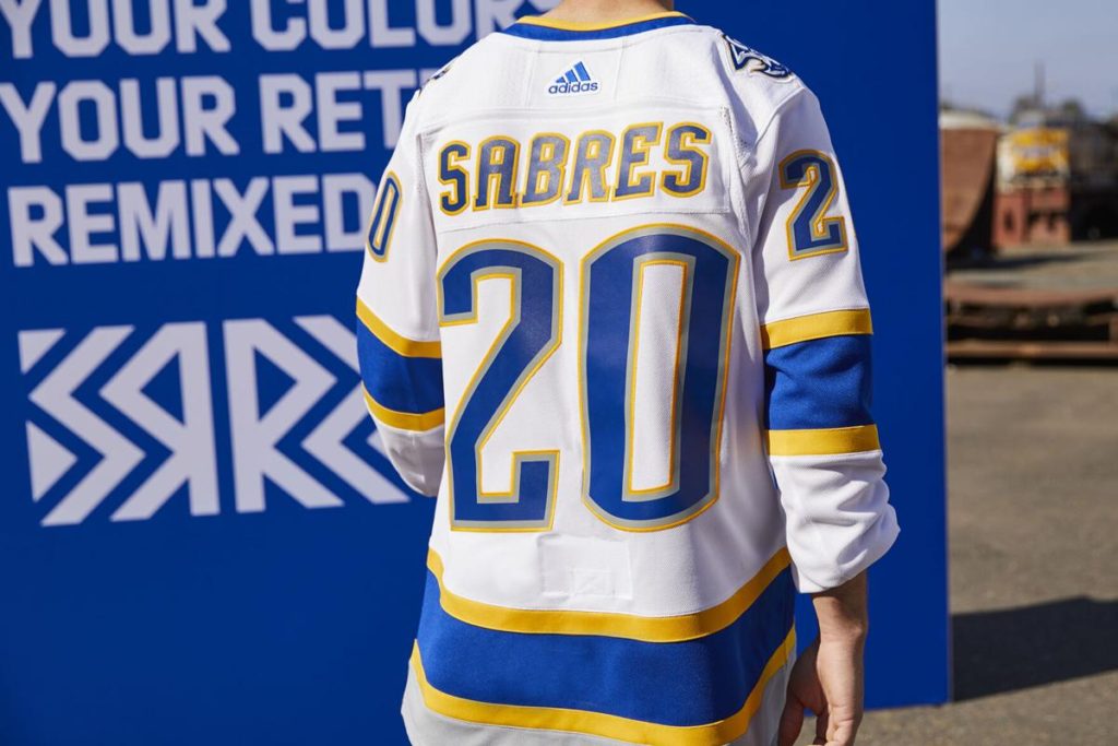
A team looking up for once. New additions to the front office, signings Staal and Hall. Sabres fans were given back the goat head, but just not the right size. The crossing swords aren’t bad, though. So close Buffalo…SO CLOSE. But I haven’t seen too much hate *yet* from their fans on these.
Grade: B
Calgary Flames
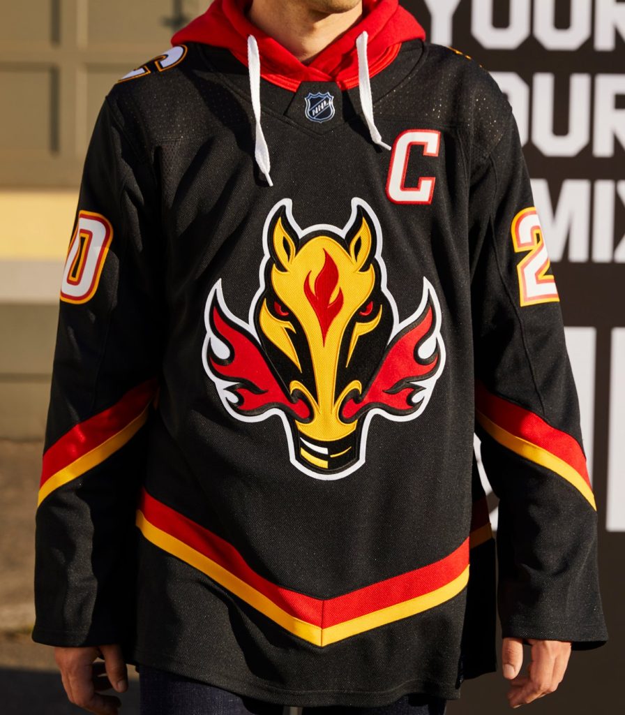
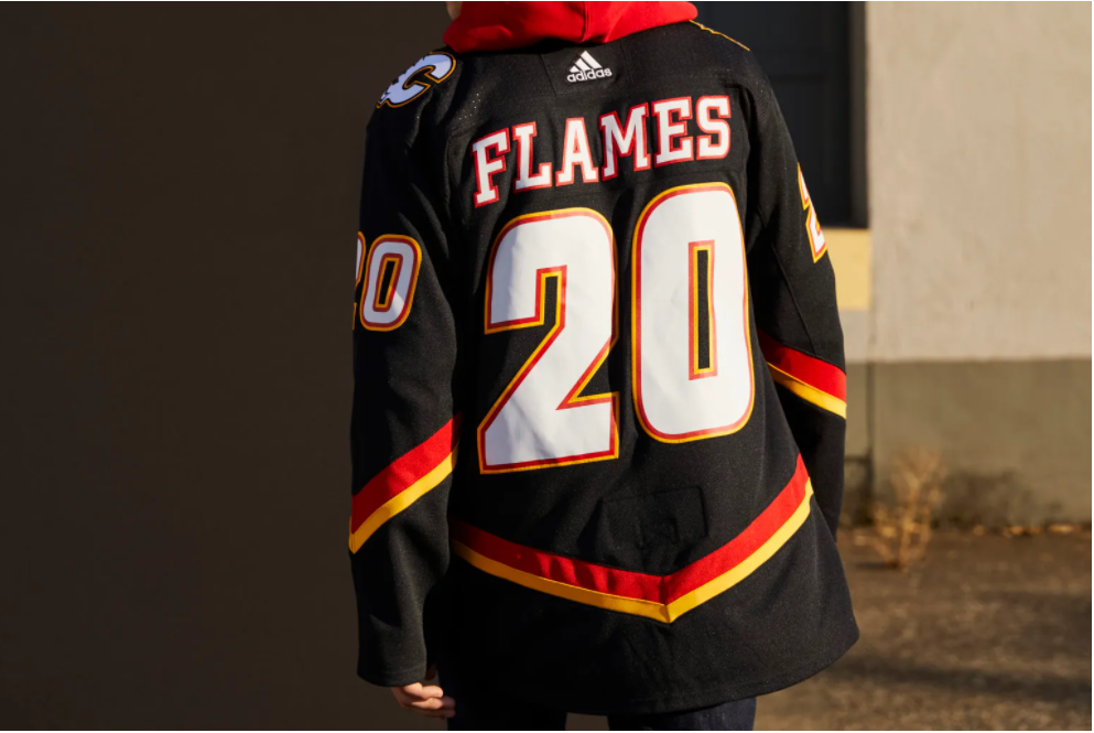
The Blasty logo reminds me of Jarome Iglina spanking genos in the early 2000s. It’s not a total reverse on their old uniforms, but a more modern look. The “C of Red” looks like it’s getting a little darker this season.
Grade: B+
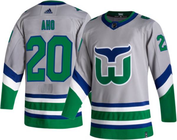
Carolina Hurricanes
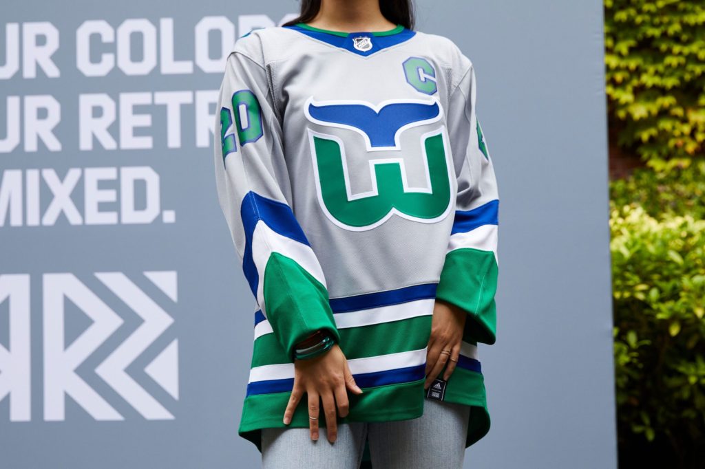
The Canes did a fantastic job with their first run of a Whalers uniform. But they aren’t The Whalers anymore. Are the Jets wearing Thrasher jerseys, or Arizona wearing Jets uniforms? Nah. It’s a money grab, if anything, and I’m sure they’ll cash out. How about an homage to the 06’ team that won them a cup, though?
Grade: D
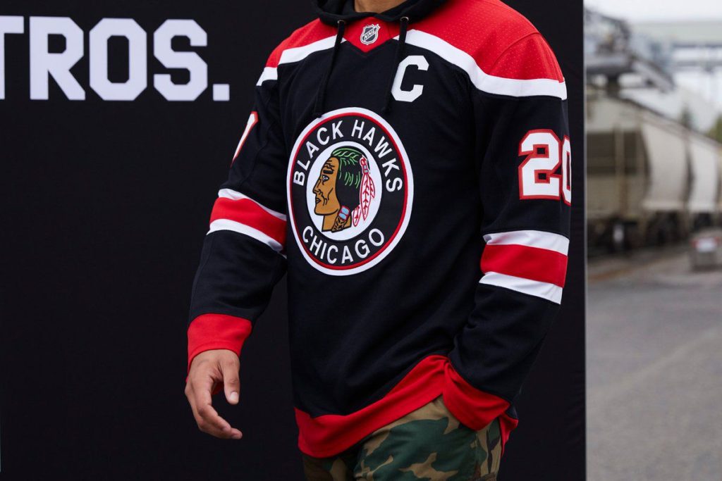
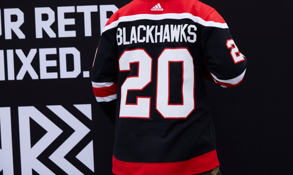
Chicago Blackhawks
The Blackhawks tried this look with the black with white trim alternates last season. Adding more of the teams’ colors doesn’t really move the needle that much on these. But the idea here was to reach out to a more retro look, but they’re “eh.”
Grade: D
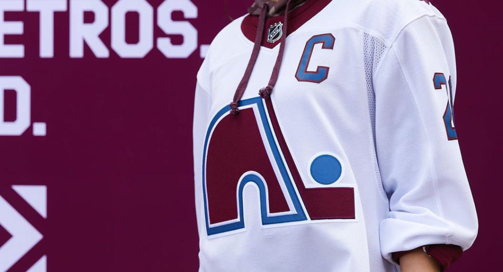
Colorado Avalanche
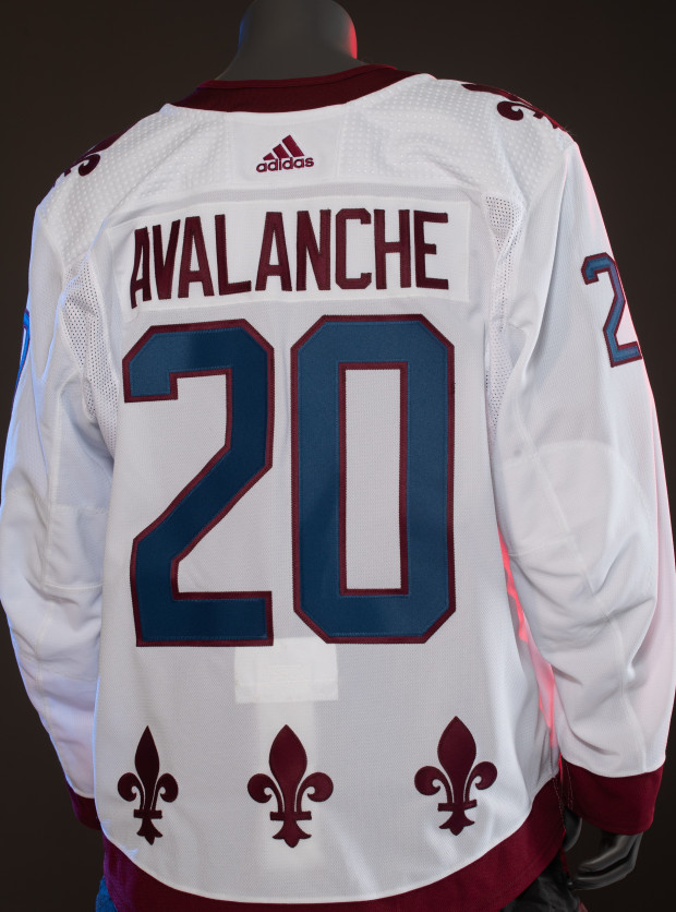
The Avs this year have finally reached deep down into the archives and brought the Nordiques logo back to life. With adding patches and some flare within the design jersey, and their 25th anniversary of relocating the team approaching, this design is fun. I sound like a hypocrite from my Hurricanes grade above, but the Avs were patient in giving their fans a modern look from a classic era.
Grade: A+
Columbus Blue Jackets
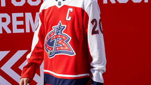
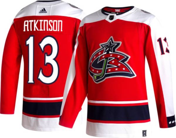
I mean like it literally looks like they took their inaugural logo and slapped it onto a Capitals uniform. They’ve never really had a thing for nice jerseys anyway. At least they could’ve used that logo with the fly from the early 2000s somewhere on it.
Grade: D-
Dallas Stars
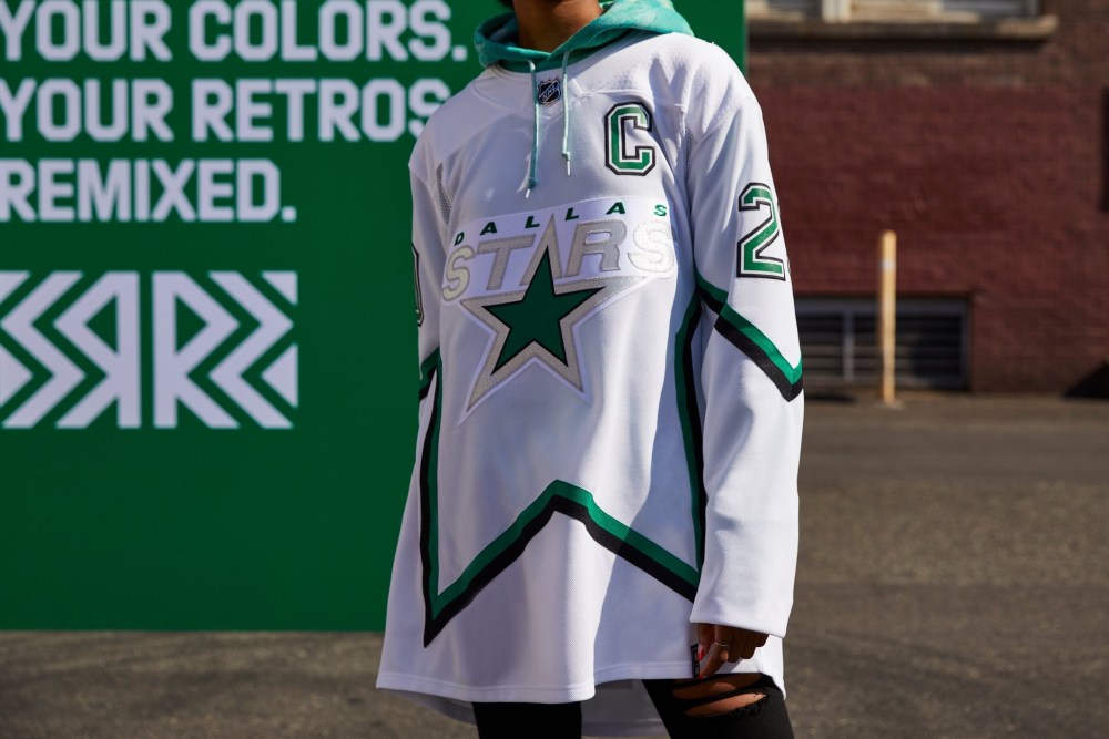
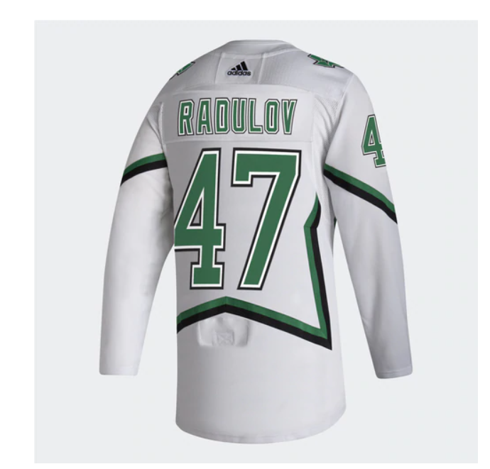
Anything is better than that hideous Taurus jersey they tried a while ago. The Stars modernized a look from their cup run in 99’. But these look like they will be an eyesore on the ice. Too much white throughout, but good try.
Grade: C+
Detroit Red Wings
Other than winter classics and outdoor games, the Red Wings never tampered with their classic red and white design. But they still managed to screw up a timeless classic. You’d think these were their new practice j’s, but ohhhhhhh, no, they are not.
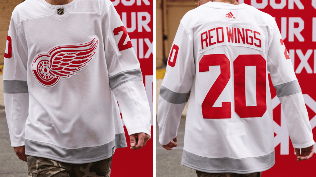
Grade: D
Edmonton Oilers
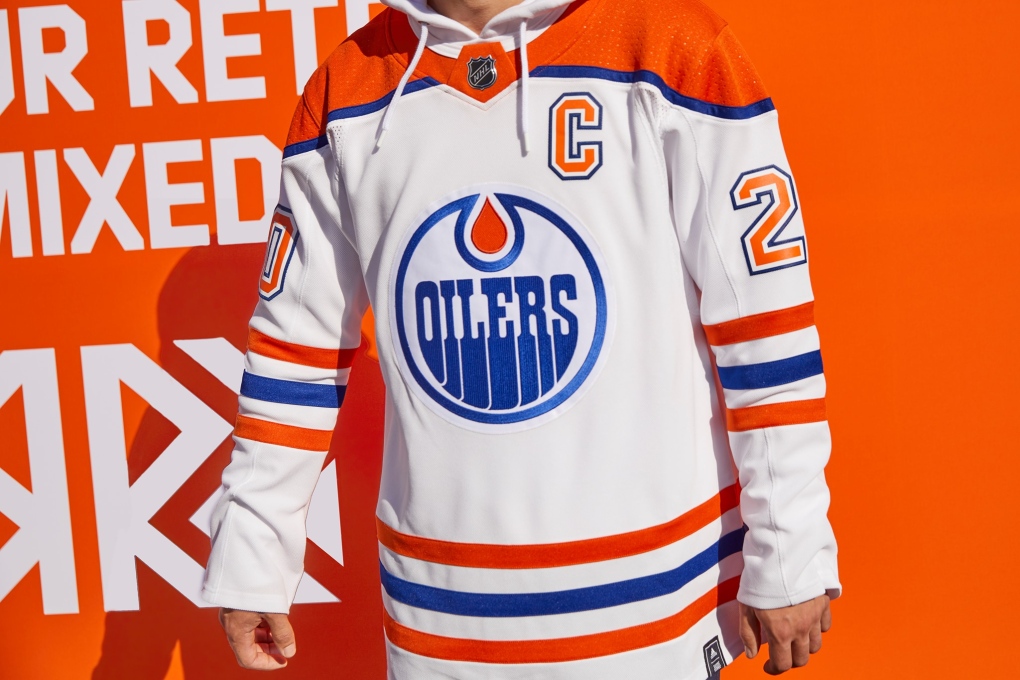
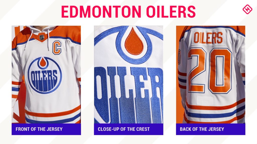
What they really did here was just give their away jerseys a brighter blue. Still a very clean look, plus McDavid is a stud so it doesn’t matter. I mean it will matter if he doesn’t a win cup there..
Grade: B-
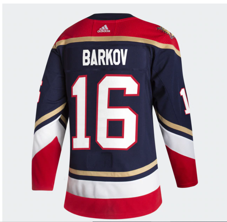
Florida Panthers
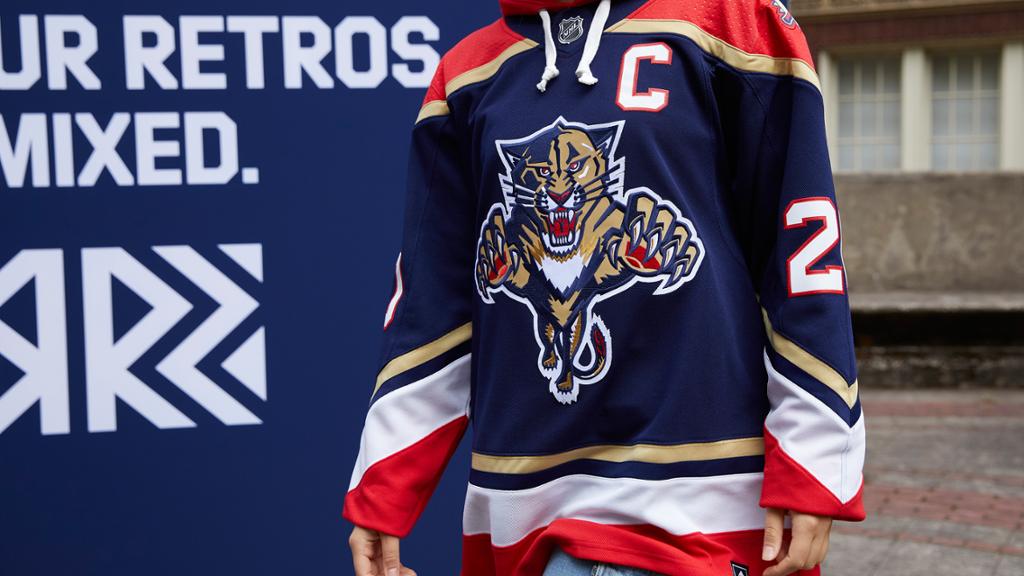
These are great. Gotta love the old cat logo. It reminds me of when Luongo got traded by Mike Milbury for Oleg Kvasha and Mark Parrish. I see Pavel Bure nipping cheese short side in the memory bank. All of the empty seats in Florida will really love this one.
Grade: A-
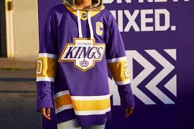
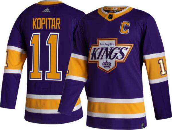
Los Angeles Kings
We’ll keep it short and sweet here. They absolutely crushed these. Bringing their best logo back to life with the purple and gold color scheme, these will fly off the shelves.
Grade: A+
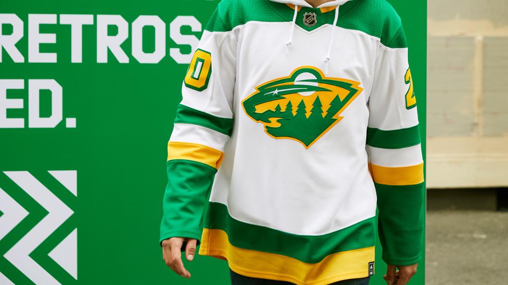
Minnesota Wild
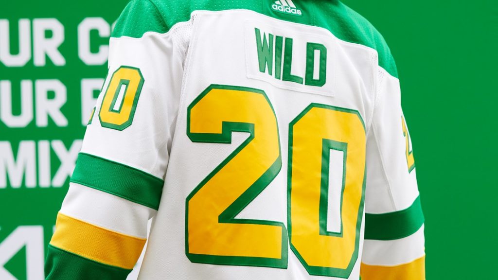
This could be my favorite Wild jersey since they became a team. The nostalgic North Star colors are great with the white base. The state of Hockey is getting some drip.
Grade: B+
Montreal Canadiens
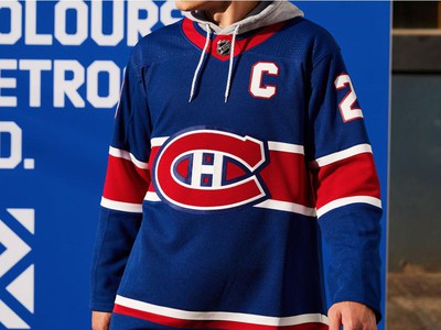
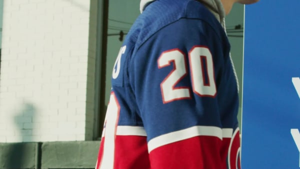
They did it. A blue jersey. It’s about time. Just a complete reverse from their red homes to blue with a red stripe in the middle. These are fresh and will look super clean on the ice.
Grade: A
Nashville Predators
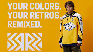
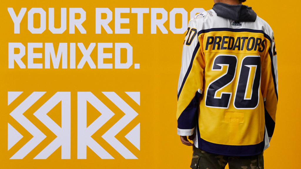
At least they didn’t go in the mustard yellow direction again. Just a complete reverse from their inaugural blue jerseys to yellow. Simple in my book.
Grade: B
New Jersey Devils
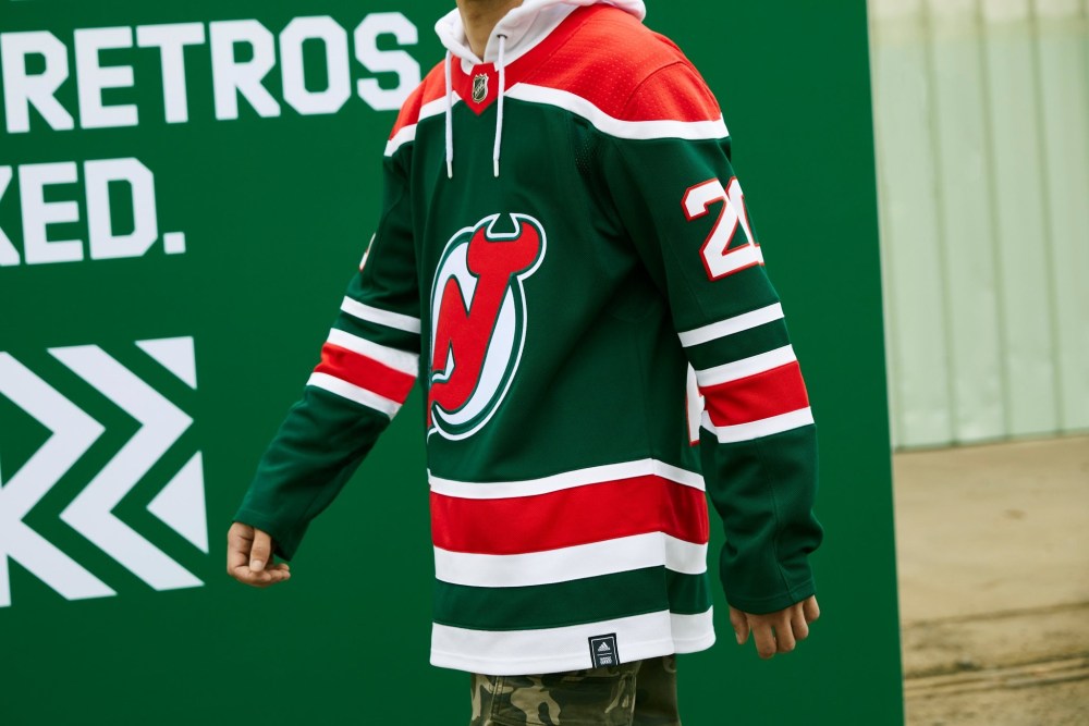
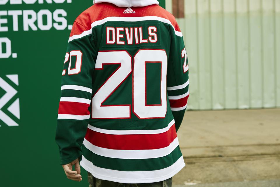
The “Garden State” Devils come out with a green-based Christmas sweater for their reverse retros. I’m not surprised. However, they’ve never had a black jersey in their lineup—a swing and a miss here.
Grade: C
New York Islanders
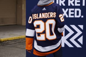
There were soooooo many mixed feelings when it came to the Isles, bringing the fisherman back. But with Lou Lamoriello at the helm, you had to know the team was going to play it safe. I’d expect more changes for both their 50th anniversary AND the Inaugural season of UBS Arena at Belmont next season. The dark blue pops, though. But the creativity wasn’t there.
Grade: D
New York Rangers
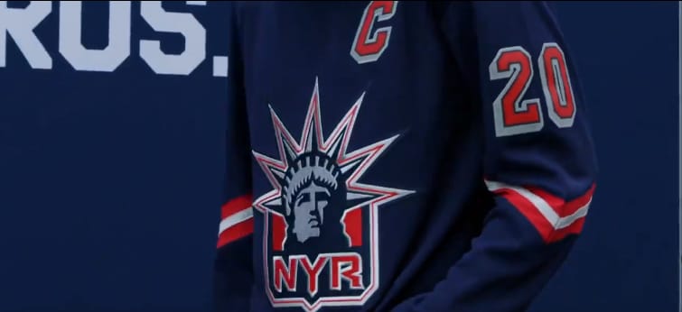
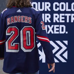
It was a no brainer to see them bring Lady Liberty back. But it’s a straight up mimic from when they wore them in the late 90’s. Clean but underwhelming at the same time.
Grade: C
Ottawa Senators
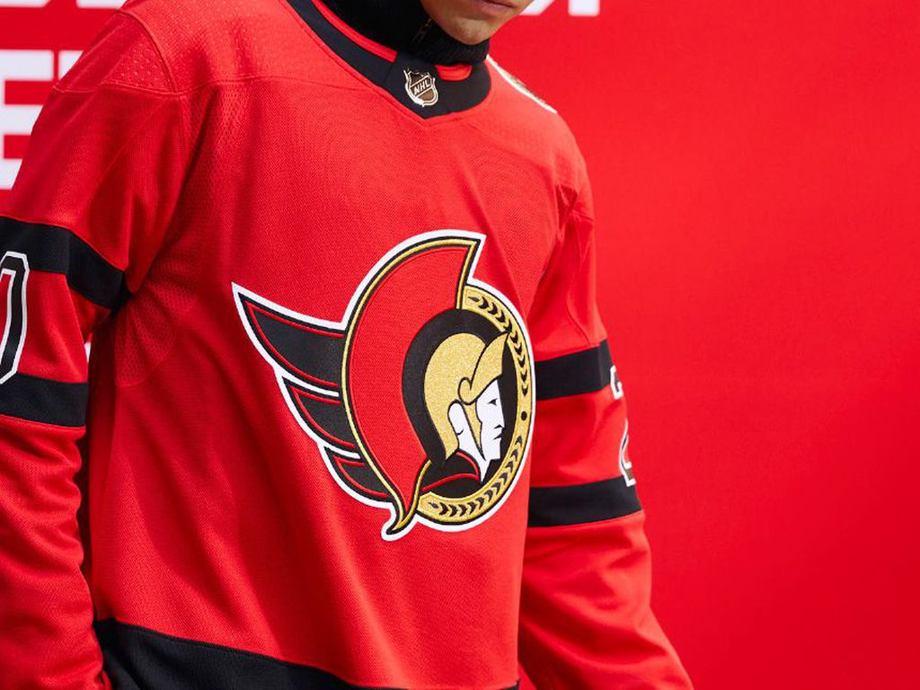
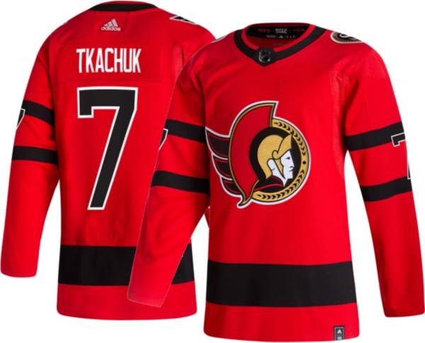
Maybe a little bit of gold somewhere in the jersey, and it’s a total home run. With the Sens going back to their roots with their logo, the red jersey should fill in nicely as a permanent alternate.
Grade: B+
Philadelphia Flyers
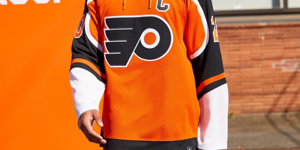
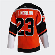
One of the first leaks we saw of the Reverse Retro jerseys. If it doesn’t scream orange, is it really a Flyers jersey? Cahtah Haht the Great Big Pumpkin in the net.
Grade: C+
Pittsburgh Penguins
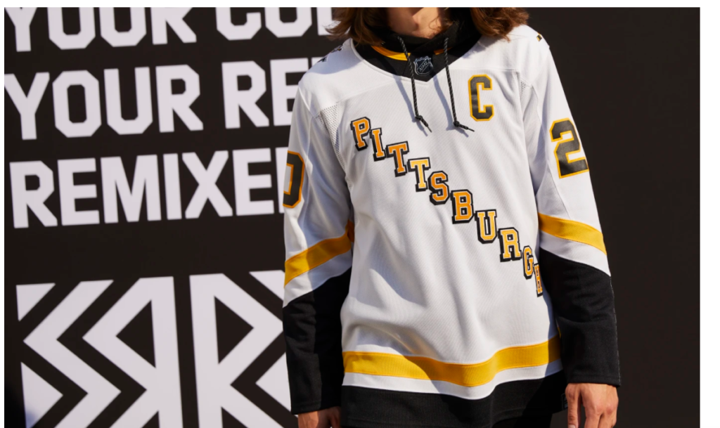
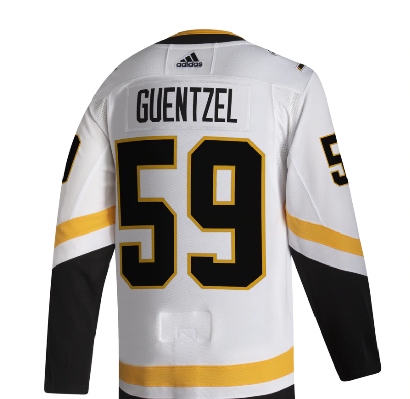
These scream Wiz Khalifa to me, and I don’t know why. I’m also not hating on them either. But I think powder blues would’ve absolutely dominated the competition for the best jerseys.
Grade: A-
San Jose Sharks
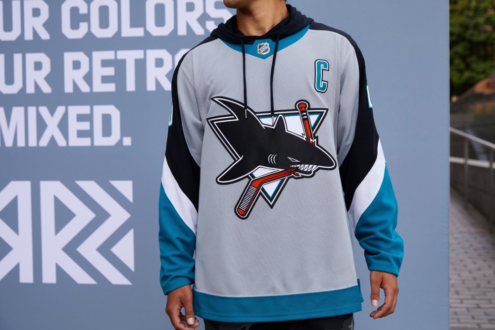
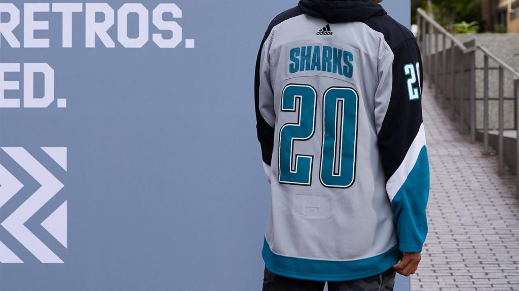
The grey is really nice, but I would’ve liked to see them use their original design a little more—still, one of my favorites if we’re being honest here.
Grade: B+
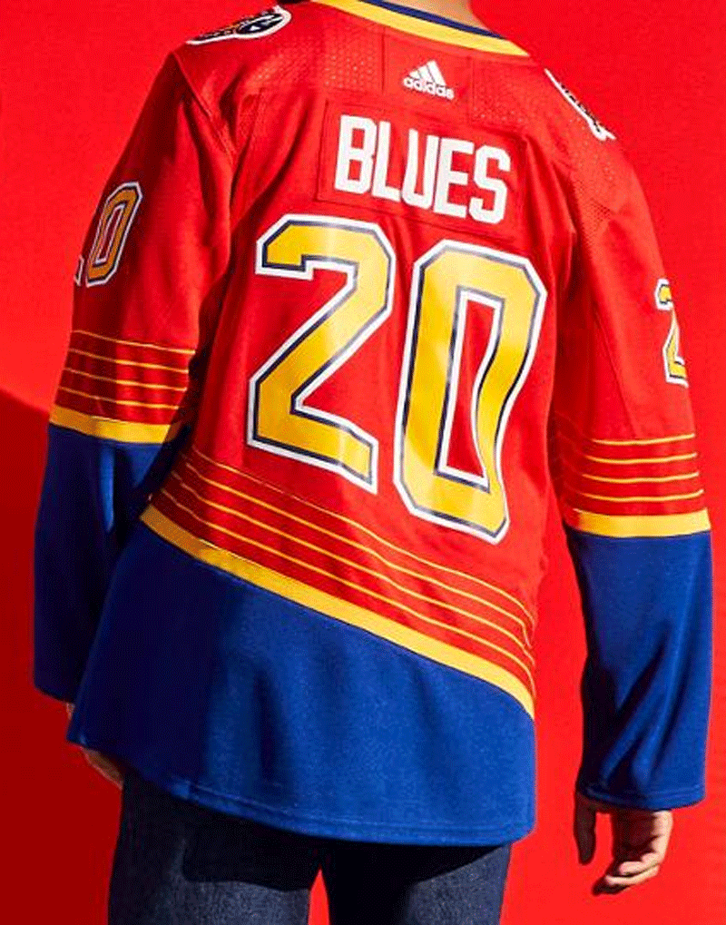
St. Louis Blues
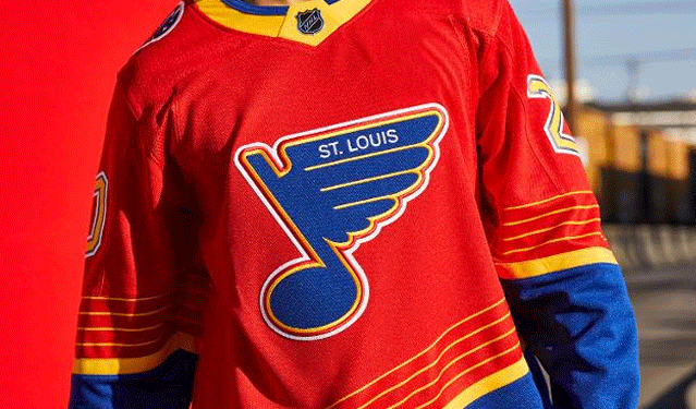
The original throwback was already pretty sweet. But I guess the purpose of this project was to reverse retro and to switch it up. The red is cool, too; it just looks like it’ll give me a headache on the ice after a bit.
Grade: B-
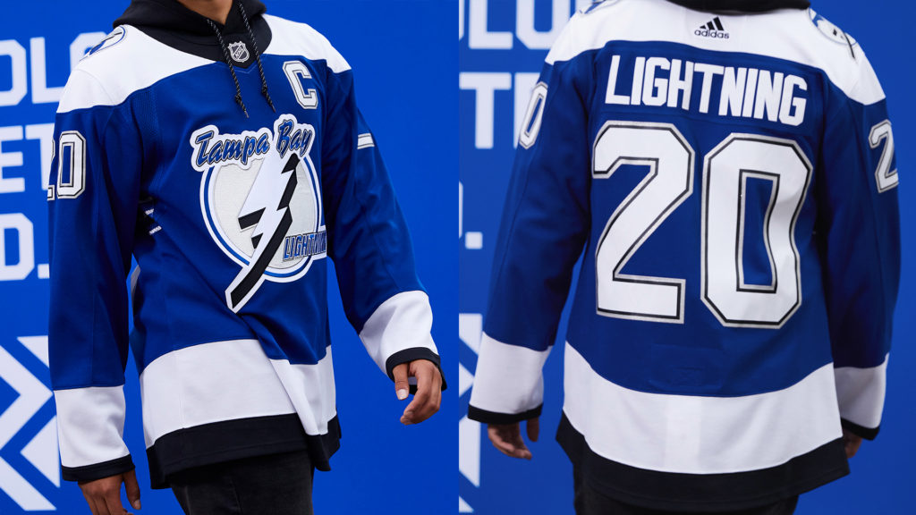
Tampa Bay Lightning
Another one of my favorites. That 2004 team with Lecavalier, Fedotenko, and St. Louis was unreal. I’m glad they came out with these in blue with the original logo. The storm jerseys would’ve weirdly amazing.
Grade: A
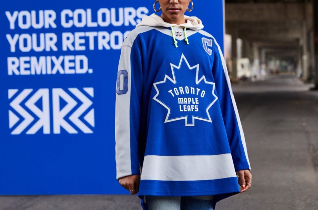
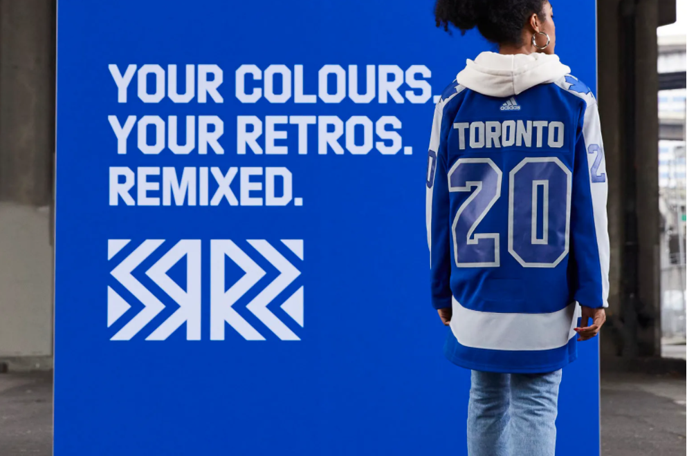
Toronto Maple Leafs
Nah, these ain’t it, chief. Any chance the Leafs get to be criticized, oh do they ever take the opportunity and run. All the letters except the n in Toronto on the jersey are capitalized too. Boooo Toronto, booooo.
Grade: F
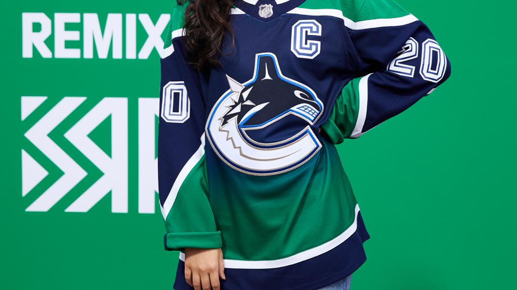
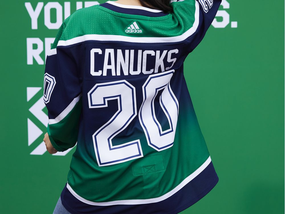
Vancouver Canucks
Instead of messing with the spaghetti skate design (good choice), they whipped up a gradient style jersey with the team’s colors now. Not a bad bet. The fans seem to think otherwise, though.
Grade: C+
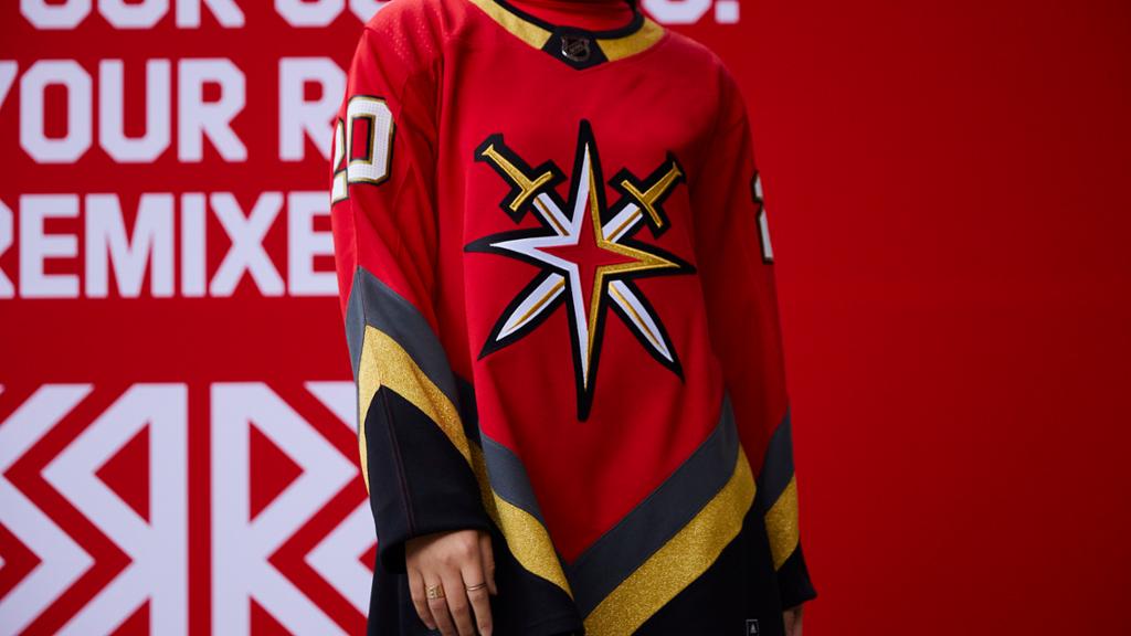
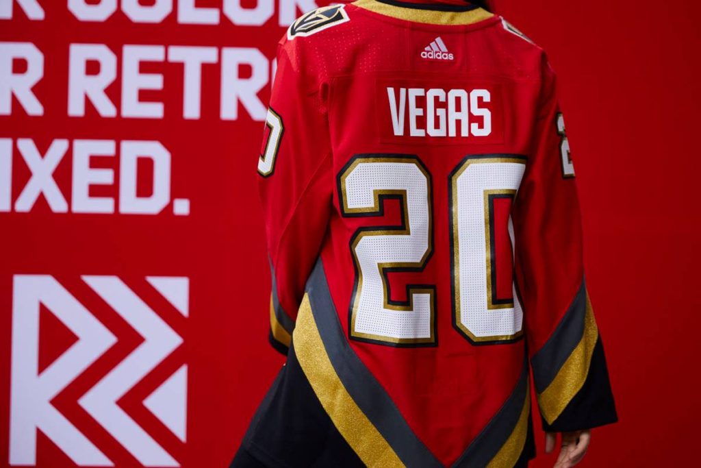
Vegas Golden Knights
Can the team even have a “retro” jersey? With only a handful of years into their existence, the Knights have had plenty of success. And with their newly added golden third jersey, I’m not surprised this “retro” jersey slaps.
Grade: A-
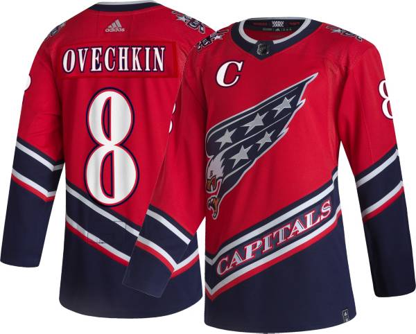
Washington Capitals
The screaming eagle was the right choice here. The colors, oh not so much? The fans have been begging for those old colors from Ovi’s rookie season, and I don’t blame them.
Grade: C+
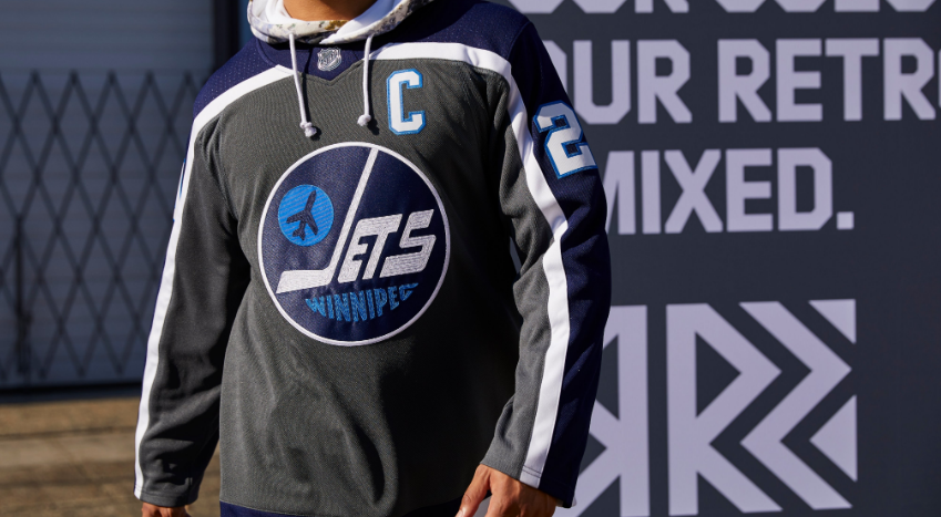
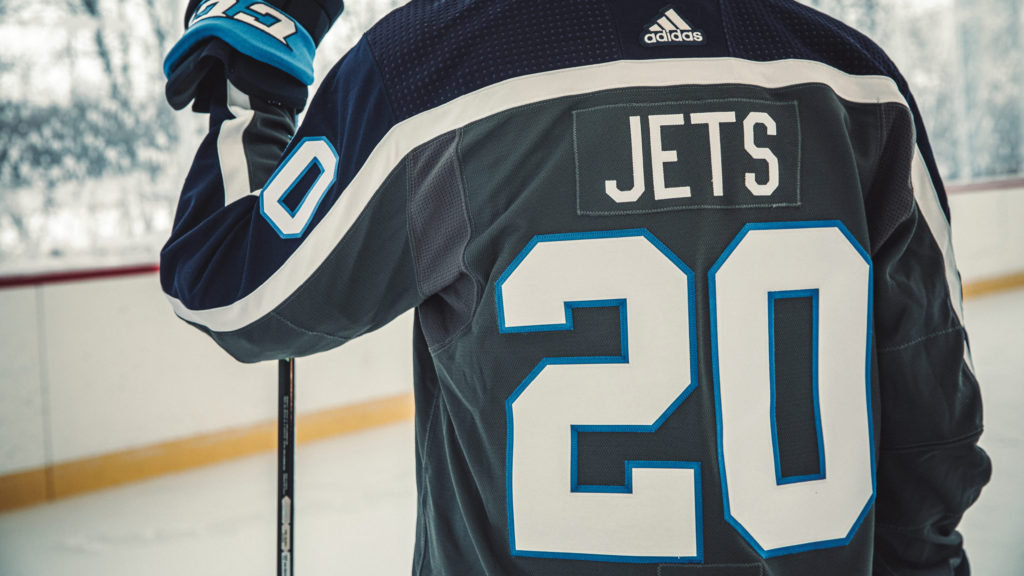
Winnipeg Jets
I personally think that their Heritage Classic jerseys are the best. But they played it safe by going with the grey base. It’ll be a nice addition to the lineup with the Jets baby blue alternates. Not bad all around.
Grade: B-
The Sports Desk can be reached at editorialtrainwrecksports@gmail.com

2 Responses
Great read Mr. Crocs. This is the best set of rankings out there IMO.